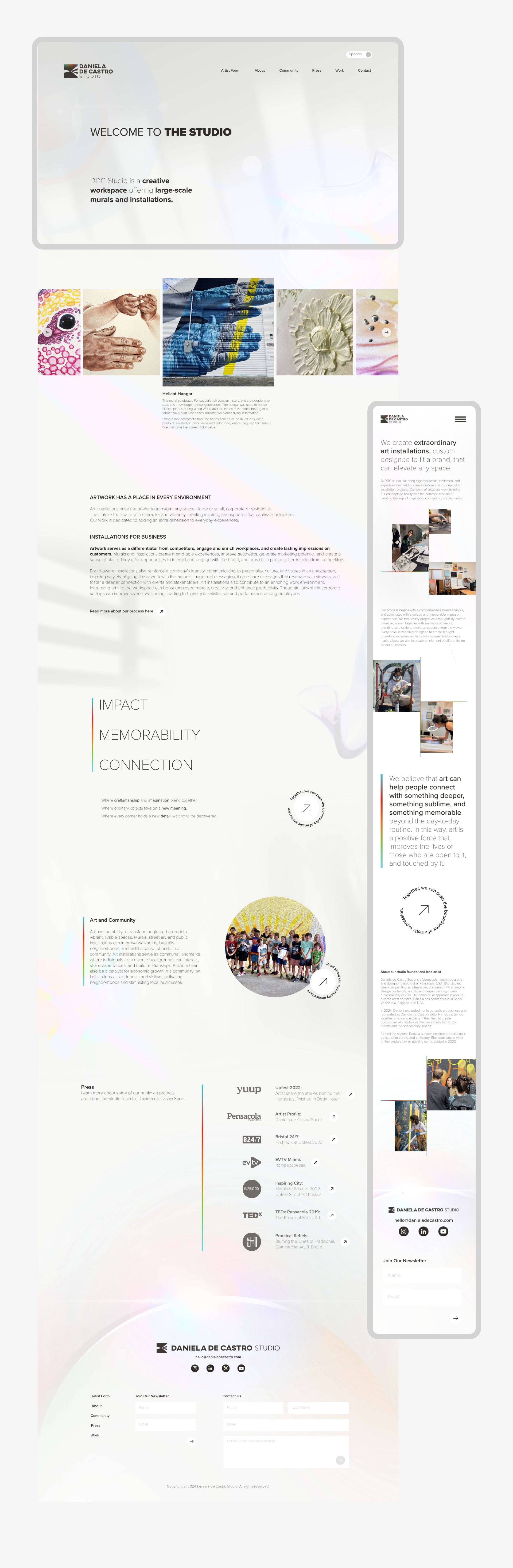

Daniela de Castro Studio | Branding | Logo Design | Web Design
For Daniela de Castro Studio a creative workspace focused on large-scale murals and installations. I developed a visual identity and website inspired by the concept that color is reflected light.
Rooted in the science of perception, the brand explores how light reveals color through reflection. This idea became the foundation for the logo and digital experience, where interplay between bold color fields, layered transparencies, and spatial rhythm mirrors the studio’s immersive, scale-driven work. The result is a brand presence that not only reflects the physicality of Daniela’s art but also invites viewers to consider how light—and creativity—can transform any surface.
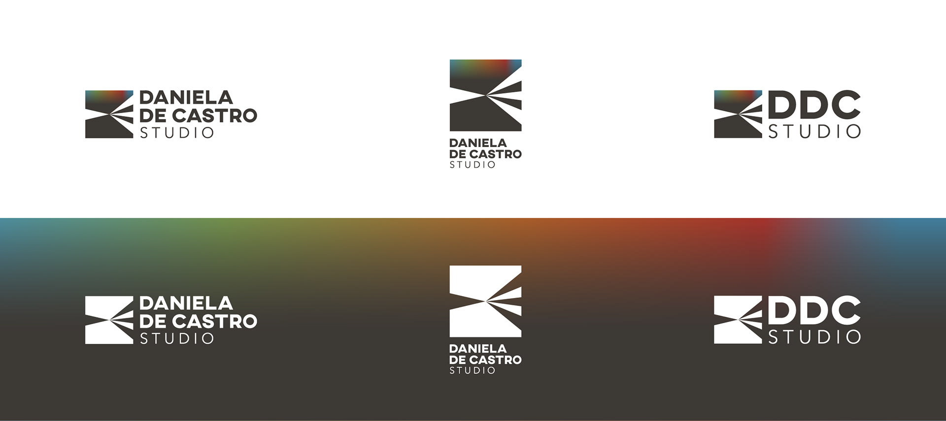
The Daniela de Castro Studio logo visually interprets the concept of color as reflected light. At its core, the mark features a geometric burst of angular beams radiating outward suggesting the moment light hits a surface and disperses. These beams direct the viewer’s gaze toward a gradient of vivid color, which appears to emerge from the contrast of light and shadow. The colored corner evokes the way color materializes when light is reflected, while the surrounding black and white planes symbolize absorption and contrast. This interplay mirrors the studio’s work with large-scale murals: transforming neutral or forgotten surfaces into expressive, light-responsive environments.